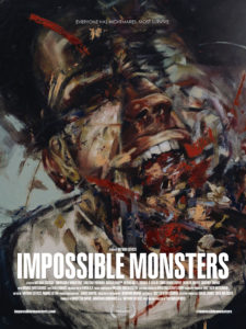
 The concept of sleep paralysis is terrifying on the very surface: one’s mind/consciousness rises from sleep before one’s body does and, in most cases, hallucinations accompany the experience. I had two occasions of sleep paralysis in a one week period last year—the only times I had it in my life. I hallucinated and it’s every bit as frightening as those in 2015’s documentary, The Nightmare. Any film that uses this as a plot element has my attention. So I sought out a screener of Impossible Monsters from the director, Nathan Catucci. I was intrigued by the title (which references Francisco Goya) and the film’s cover. Sometimes films, books, and albums can be judged by their covers.
I wish this film cover hadn’t let me down, but I can’t quite figure out if the sleep paralysis angle was just something to cover up the rather by-rote narrative that laid underneath; or if Catucci actually felt like it was playing a part in flow of the narrative. For whatever reason the concept and plot never came together in a cohesive whole that would shift a viewer’s frame of reference by its final scene. Instead, we got a what amounts to the “Las Vegas-style” of filmmaking: it’s basically a box with a gaudy facade on it.
 Where this film could have potentially salvaged some of its best aspects is by really leaning into the characterizations more. As it stands, each character felt like the most generic version of themselves. The social worker was optimistic and aiming to help the kids she serves without a hint of weariness in her face or actions. I just have to look to my wife to see how this character felt too idealistic. The artist felt like too much of a moody navel-gazer, a creative loner who falls asleep on his paint-strewn drop cloth. I’ve met many artists and none have fit this category even though it’s the stereotype that continues on. Even our protagonist doesn’t have any quirks as a professor and academic. He is all business, except when he’s not. There’s no internal life for any of these characters. If Catucci had made each characterization more specific and real, then the general appeal would have followed. Make the audience find a way to relate to the characters, not the other way around.
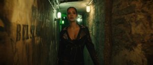
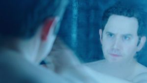
 While all of this seems really quite negative, there is nothing that says a facade can’t be somewhat effective. There are some interesting building flourishes in Las Vegas, just like there are interesting visual elements going on under Catucci’s control here. Visions of snakes writhing up a bed and wrapping itself around a character, a blood-soaked hell-human writhing on top of a character, and the simple jump movements made during the nightmare segments of the film are the sign of someone who has a particular idea in mind, but maybe doesn’t have the budget or the acting talent to pull it off in a completely satisfying way.
While Nathan Catucci’s first feature doesn’t quite satisfy during its runtime, there is something in his visual imagery that makes me think with more experience and more budget—and perhaps a different writer—he has something to really offer the silver screen. There was enough going on here that I’ll be keeping him on my radar while this film will probably slip from my memory.


